How to Redesign Your App Without Pissing Everybody Off
The era of User Generated Discontent began about a decade ago, when a critical mass of people started using social apps on the web often enough that they felt a bit proprietary over the user interface and design of those services. Inevitably, that led to mass revolts and widespread complaints any time a company changed even the most minor parts of its user experience.
From Facebook’s introduction of News Feed and Timeline to Twitter’s launch of New Twitter and New New Twitter to countless angry responses to any given logo change, the spirit of “Why Wasn’t I Consulted?” runs deep on the Internet, and perhaps in no realm is it expressed more passionately than in user interface design. How come we keep screwing it up? Is it possible to change a UI without inciting a riot?
It would appear so. We just have to follow some principles based on learning from the last 10,000 times that a mob of users got upset.
Saving Face
Yesterday I talked about how all dashboards should be feeds, using the example of our work with ThinkUp. I sort of glossed over it by saying “we threw out the old UI when we built version 2.0”, but the reality is we totally redesigned an app that had been designed by a community, and nobody got upset. So it’s possible to do this! But how? By obeying a few principles:
- Communicate in advance with the community about what your goals are. You’ve got reasons for making a change in your app or site, but they should be grounded in meaningful goals that meet user needs. “We want to increase engagement” is not a goal, or at least not one that you should try to get a community to care about. But “we want to make sure new users aren’t overwhelmed with options” is something people can actually respond to intelligently. If the community can understand your rationale, then they can help you achieve it, or at least begrudgingly concede that it’s one of your priorities. And the time to do this is before you actually put the new version out. If you’re concerned about revealing secrets to competitors or to the market, then just speak in broad terms without revealing exactly how you’re going to change the app to meet those needs.
- Enforce communications discipline amongst your team members when communicating the change. Everyone who knows a change is coming should get together and discuss how they’ll talk about the redesign, and should work together to come up with consistent ways to describe both the goals and what’s up for discussion in terms of future adjustments. Be hyper-responsive and very present as soon as the change is announced or released, to respond to complaints or questions wherever they happen. And if someone on your own team is worried about a design change, or disagrees with its implementation, you can bet that many of your users will feel the same way.
- Describe the audiences you’re trying to serve by making changes. One of the most common tensions with a community is when you make a change to address one part of your audience, making the other people you serve feel left out. If you optimize your mobile UI, desktop users get mad, or if you shift an element on the page so that international languages get a better experience, your primary language users might be frustrated. And no matter whoyou’re serving, some people will say “Why did you fix that instead of fixing this other thing I care about more?” So articulatingwho a change is meant to serve helps to focus the conversation about a change in a useful way. We did this in a very literal way, simply writing a blog post called Who is ThinkUp for? to start to define our target audiences.
- Give people structured ways to provide feedback and comments. Okay, so your users are asking “Why wasn’t I consulted?” about this new change — now what? There should be clear, consistent ways for them to get heard, whether that’s through social media or email or a comment form or any other mechanism. So many companies, especially big companies, screw up on this part by hoping that refusing to provide a forum for user complaints or feedback will somehow stop a backlash from coming.
- Define a process and timeline for iterating based on feedback. Many of the issues that your community complains about or brings to your attention are going to be legitimate! They’ll be raised in the spirit of a productive conversation, and you have an obligation to respond to those points with plans that are as concrete as possible in addressing them. So, be ready before you announce your changes with a team that will estimate the effort involved, and roll out those updates as efficiently as possible.
- Set a measured, rational tone with your community. This is something you need to be doing well in advance, but if you set the expectation that changes will be responded to and both your team and your users are going to communicate about them respectfully and calmly, people will follow the prevailing culture of the conversation. On ThinkUp, we’ve had a mailing list for almost four years where there’s never been a flame war. That’s almost unheard-of in open source, and in addition to making things less stressful when we make a change, it helps us attract good, diverse talent to our community.
- Accept that some people will never be happy. This is the sort of zen aspect of community management with changes, the one you have to confront by reciting the serenity prayer. Some people are determined to be unhappy, usually for reasons having to do with their personal lives or other challenges, and they simply want to use your app as the platform through which they demonstrate it. As long as you can contain their tantrums and direct them away from those giving productive feedback, they’re not that hard to deal with.
- It helps if people don’t care that much about your app. This is more of a worst-practice than a best-practice, but we began to explain our reasoning behind a radical change in our user experience by talking about what sucked in older versions of ThinkUp. As painful or humbling as that exercise may have been, the criticisms that were leveled resonated as being accurate with our community, and gave us permission to pursue a more aggressive redesign. So one takeaway if your community gets upset is that you should thank them, because it indicates passion about what you’re doing.
Humility Above All
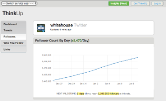
This is far from a comprehensive list, but these are some of the basics that you’ll have to accommodate if you want to not make your users mad. If you have a super-small community, you might be able to skip some of these steps. But overall it let us go from an app that looked like this:

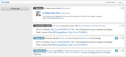
To one that looks like this:

Without anybody getting upset. It’s not inevitable that every change on the web has to involve drama; By carefully anticipating people’s responses and thoughtfully engaging with your community, you can actually come out of even a dramatic UI redesign with people happier than they were before.
Related Reading
Many of these ideas of community management are far from new; Lots of people liked a similar piece that I wrote a few years ago called If your website’s full of assholes, it’s your fault.
If you’re a developer or designer, you might want to follow along and make sure we put these principles into action by joining ThinkUp on GitHub.