Flags, Windows, Lucky Numbers and Hidden Mickeys
Another new version of Windows is nearly upon us, as Microsoft will release Windows 7 later this year. Vista was greeted with probably a few too many jeers, which in the tech industry means Windows 7 will probably be greeted with a few too many cheers as compensation. I’ve used it for a while, and Windows 7 is fine or even great if you like Windows, and will not be fine if you don’t. But I found some interesting points in the initial marketing materials that are starting to become visible across the web.

Microsoft’s gradual design evolution from Windows 3.1-era “What’s design?” to XP-era “We’re trying our best!” has graduated with Windows 7 into the first visual design touches that are thoughtful, clever, and perhaps even witty. It starts with the logo and promotional graphics for the new version.
There’s been a (likely-unplanned) public reveal of the branding around the new release thanks to a site called Windows Lounge. Staying true to Microsoft’s uncomfortably awkward corporate culture, the Windows Lounge site is a standalone one-page website that features a YouTube video and some text instructions, all designed to get Microsoft employees to join a Facebook group where they can talk privately about what’s planned for the new Windows release. Yes, they’re using Google’s video service and a private Facebook group to have a conversation that, being aimed at Microsoft employees only, could take place on their own intranet. But I’m not judging that part!

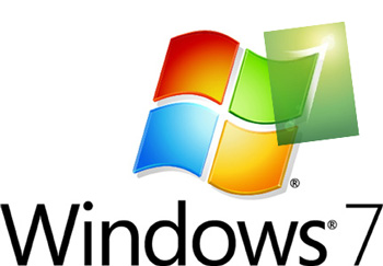
Instead, look at the clever “7” graphic I’ve included here, which I cropped from one of the Microsoft promo sites. It’s clear and simple, like the “7” name itself — no inscrutable “XP”, no overly-broad “Vista”, just a version number like software used to have in the olden days. Sure, the overdone lens flare gives it a little bit of that I’m-blinded-by-your-brilliance presumptuousness that made squinting my way through the otherwise-delightful new Star Trek movie a little painful. But overall? It’s as good a job as any logo Microsoft’s done, and it maybe even suggests a > greater-than sign, subtly indicating that this new product represents an actual improvement over whatever version of Windows you’re enduring now.
But the moment of delight in truly pleasing designs comes in the reveal, in the sense of discovery that maybe there’s something unexpected or unexpectedly familiar in a graphic. It’s that moment of FedEx arrows and hidden Mickeys. Which hit me when looking at the familiar Windows flag logo. What if we take this new 7 logo and overlay it on that old standby Windows flag? We get something like this:

Hey, that’s pretty cool! It’s not perfect, probably as the result of some hand-tuning of the 7 logo. But to take a familiar icon like the Windows flag and use an element of it in a new way — that’s a step forward for Microsoft’s visual design efforts in terms of thoughtfulness and care. It even echoes the simple, understandable branding of the new platform itself, which uses a lucky number to try to get back some of that feeling (now almost completely forgotten) of when people used to be curious and excited about new Windows releases. You can imagine exactly how they’d animate this luminescent logo in an advertisement, without even having to see it done — that kind of evocative immediacy has rarely characterized any past Microsoft design efforts.
Of course, I’d be remiss if I didn’t point out that the larger corporate culture at Microsoft outside of groups like the Zune team is largely indifferent to design, except where it’s actively and aggressively anti-design. Take the official corporate logos page on the company’s press site. It features the usual array of Microsoft, Office and Windows logos, along with other smaller products and whatever the hell the Forefront/System Server mesh-typhoon thing is supposed to be. (It’s a logo that screams “this product is not for people who like having sex!”) But then there’s that familiar Windows flag, in large and small versions, laid out however you might want it.
The small version is basically the same as the Windows 7 logo you see above. And the big version, designed for print editors to use in their publications? It looks like this. You can almost hear the folks who were just celebrating their success with the 7 logo sighing and shaking their heads when you click on that link.