Pixels Are The New Pies
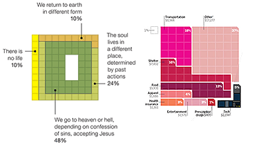
An interesting infographic trend: Square blocks of color are now being used to represent percentage-based statistics instead of the traditional pie chart. Some recent examples are shown here.

The chart on the left is from a NY Times story on atheism and the afterlife, making its choice of colors seem a little weird. And is that empty white block in the center supposed to represent the empty hole in our souls? On the right, a detail from a Wired story on how much Americans spend on gadgets. Charles M. Blow created the graphic for the Times; Arno Ghelfi did the honors for Wired.
This switch raises some interesting questions.
- Is the square format more familiar to readers now because of the preponderance of the pixel in pop culture?
- There’s a lot of leeway in choosing the shape of individual regions, since the only constraint is that they use the proper number of squares — what are the best practices here?
- Finally, a productive use of all that time spent playing Tetris?
- How come it took so long to figure out that pie charts are pretty hard to actually glean data from?
- Was there a “Designing For Print” conference somewhere six months ago where a speaker made a particularly compelling case for squares over circles?
Somewhat obliquely related, my series of posts last year on 100 Perfect Pixels, featuring Nike Plus, Amazon’s Gold Box and Vox’s Neighborhood.