Office 2007 is the Bravest Upgrade Ever
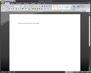
Short and sweet, the Ribbon and new UI in Microsoft Office 2007 is** the ballsiest new feature in the history of computer software**. I’ve been using Office 12 for about six months, and not only has it made me more productive, I’m struck by the sheer ambition of the changes in this version.
To clarify the point: Microsoft Office is a bigger business than most of us probably realize. Office generated $11.5 billion in revenue for fiscal year 2005, and it’ll exceed that in the current calendar year. But conservatively, you’re talking about a billion dollars a month.
Now, most of us who like to prognosticate and pontificate about software like to say things like “It’d be easy to just…” or “It’s trivial to add…” but the thing is, most of us aren’t betting our entire careers on the little tweaks and changes we’d like to make to our productivity applications. Try making a mistake that jeopardizes a business that makes $250 million a week. I’d figure a 2% error, on the order of $5 million, gets you very, very fired. Maybe they’re forgiving and you can make a 10% error, costing $25 million a week. I doubt it. Most of us would lose our nerve about suggesting radical changes if betting wrong meant betting lots of jobs on making the right call. (Nobody ever got fired for making incremental improvements to Office.)
Now, that being said, there have been really gutsy software improvements before. The leap to OS X from the classic Mac OS was huge, but revenues were much lower for Apple then, and the risk was mitigated by Apple’s tight control over hardware and software integration. So, the change was radical but less gutsy. Windows 95 was a huge change, but it was before most consumers recognized that Microsoft had them by the short hairs, so it didn’t feel quite so overbearing, and there was pretty great backwards compatibility. Honestly, Windows 95 was more of a Microsoft necessity than it was a risk — Windows 3.1 had serious competition for people’s future upgrade path.
Microsoft Word 6 (yep, on Windows, not on the Mac) was another software milestone; Getting out of the features war, declaring victory in the desktop applications battle, and starting to focus on usability, discoverability and user tasks marked a huge leap forward for productivity applications. Plus we got that little wavy red underline. But this, again, wasn’t that risky. Back then, some number of people were going to upgrade their word processor just to see what was new. Netscape 4 was seen as pretty risky at the time, but um… yeah.
So there have been very few bet-the-company style risks, and certainly none from companies as large as Microsoft. What’s more, the market for third-party applications on top of Office (er, the 2007 Microsoft Office system application platform) is bigger than most standalone software companies. There’s a real risk of jeopardizing those line-of-business customizations that most large organizations use alongside Office. And of course, the 500 stodgy Fortune 500 CIOs who make the purchasing decisions about upgrading Office aren’t going to be happy they lost their “File” menu.

But Microsoft did it anyway. They killed the File menu, along with all the other menus. They added a giant, weird circular target up in the corner. They actually use part of the title bar as a menu sometimes. They even changed the default font in all the apps. What’s amazing is not just that it works, but that it works so well.
My experience has been the same as most of those who I know that are using the new version: Word went from being frustrating and confusing to fairly straightforward to use. PowerPoint went, in a single upgrade, from being the worst widely-available presentation software to being the best. Excel is a fundamentally different kind of spreadsheet application, focused on presenting information usefully instead of optimizing for the creation of complex formulas.
I used to make a big part of my living doing customizations on top of Office, so I still know it pretty well. It also means I can be a harsh critic of their decisions around the platform. But this time I’ve got to give it up: By radically changing the user interface in Office 2007, Microsoft made the riskiest bet in the history of commercial software. And I think they’re going to win the bet.
Some related links:
- Amazon: Microsoft Office 2007 reviews, versions, and features.
- Michael Sippey: Chrome Isn’t Hell
- ArsTechnica: First thoughts: the Office 2007 ribbon
- My own post on Jensen Harris’ Office UI blog
- Microsoft’s Office 2007 Beta download
- Four years ago, Word’s file format vs. WordPerfect’s
- Two years ago, Excel Pile
